Noah Loesberg
Ornament, in and of itself, excites, it precipitates pleasure. Historically there are confounding relationships between the prohibition of icons, the presence of ornament and pleasure, both visual and otherwise. Christian iconoclasm, it is generally held, was inaugurated by Leo III somewhere in the latter years of the Eighth Century. Fealty to the law of the Decalogue aside, the motivation for the ban is historically opaque. Islamic influence, class animosity, regional conflict and power contest with the larger Christian community are each and all cited. The relationship of the prohibition to the florid and elaborate ornamentation of illuminated manuscripts, which pre- and post-date the emperor’s fiat, is also unclear. Emperor Leo’s prohibition assuredly saw a decline, though not elimination, of figural representation but also a continuation of non-figural ornamentation. Taken with a grain of Freudian salt we could propose that if repression produces symptoms then iconoclasm re-births ornament. But if so, what then are ornaments symptoms of?
Noah Loesberg has, in his studio toil, addressed a broad, broad catalogue of ornamentation. He has certainly used luscious visual passages familiar to us from illuminated manuscripts. But he has also trawled the somewhat more secular worlds of architecture and interior design, running his historical dragnet through the content of the Sears catalogue for example. And straying yet farther afield he has embraced as ornament what the British call street furniture —storm drains, highway barriers, sewer pipes– the stuff usually found at the periphery of our visual and cultural attention span.
By turns the work foregrounds a quotidian experience of pleasure; there is a sort of erotics of ornament. And then, in a deft turn it engages authority, the authority of prohibition. It is this particular ornament, “This one!” announces the voice of authority, this one shall be the site of pleasure and not the graven image that it displaces. In this latter context Loesberg’s broadened interests weave in another layer to this putative struggle between function and ornament. Loesberg reports on his fascination, “with histories and traditions of ornamentation and decoration, standards of beauty that modernism tended to wipe clean or flatten out.” Just as modernism suppressed (or at least sought to) any and all particular iconographies of regionalism, so too it banished the high yearning, decorative ambitions of Art Nouveau and Art Deco. With ornament quarantined as petite bourgeois amusement the historical debris pile up and Modernism becomes the authority but also, in a way, the philistine. Assuming, perhaps dangerously, that there is some common –but less than conscious– cause between the philistine and the iconoclast.
And even though Loesberg assures us he is not “didactic on the point” a kind of double iconoclasm takes hold. An echo resounds as we watch, particularly in architecture closest as it is to Loesberg’s concerns, modernism’s austere and sanitary lines suppress ornament, and then in Loesberg’s studio ornament races past the modernist hare. As Loesberg opines, “despite modernism’s best efforts, everyone loves old buildings with original trim work and molding.” Let’s give him the point, even though not everyone loves said trim and molding, the point is in the dialectic he reanimates. The ornament is presented without an object to embellish, without a lack to disguise, without an absence to excuse or a class to absolve. By giving us just the ornament itself, Loesberg returns the repressed of Modernism for us to behold.
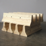
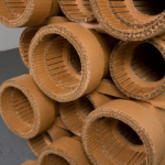
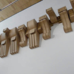
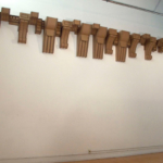
And so in Rosettes and Plinth Blocks (2016) a sculpture made from a stock wood molding available in pretty much any lumber store in the country, Loesberg quite simply, and defiantly, repeats the ornament –again and again and again. Rhetorically it seems that the piece could extend to infinity. Space, whether it is the space of the picture plane, or that of architecture annexed by Modernism, or the quotidian space of hoi poloi America that lived forever outside that modernist regime, is here overrun or hijacked by the stock molding profile to be found in pretty much every middle-class home in the United States. Then if we turn from this to Cardboard Cornice (2007) where, in Loesberg’s words, “The decorative impulse in early 20th-century tenement construction is given free rein.” A line of architectural cornices butting one another describes a decorative and functionless line across the higher reaches of the studio wall. This work is sized as “dimensions variable,” and one can imagine the line of cornices ongoing, alliteratively chewing up space, across white-cube walls toward the farthermost horizon line. The colonization, the real estate-grabbing decoration overrunning the functional wall, the room, that is, the very meat of architectural need, is Loesberg’s inverted parable of Modernism’s banishing architectural embellishment.
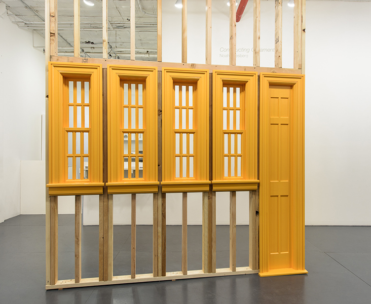
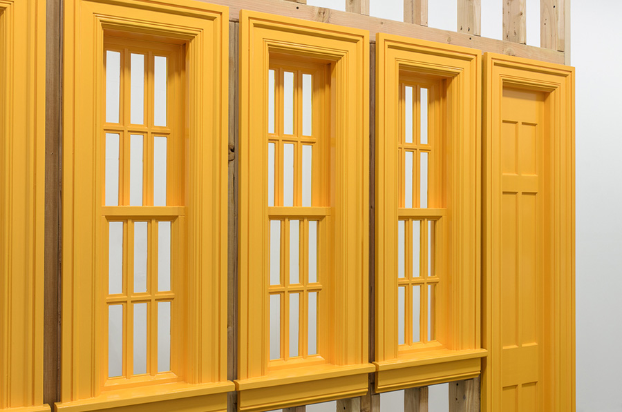
Another facet of the same ploy around decoration —albeit through a more restrained or ascetic variant of molding— shapes our experience of Four Windows, One Door (2015). Here Loesberg presents, painted in bright sunshine yellow, a wall of windows and a door. The viewer’s kinesthetic and even proprioceptive sense is turned topsy-turvy because the sleight of hand that Loesberg has deployed here is to compress the horizontal dimensions of the windows and door, while leaving the molding at the original, standard measurement. The effect is of a scaling-up of the molding ornament, which in turn, functions as a stand in for a rhetorical repetition. Hence, the functional aspects of the construction shrink, while the decoration wells up and seizes territory. Deprived, more or less of utility the door and windows themselves make a rangy bid for ornamental presence. With function undone, the dialectic that holds ornament and purpose in their adjacent places collapses.
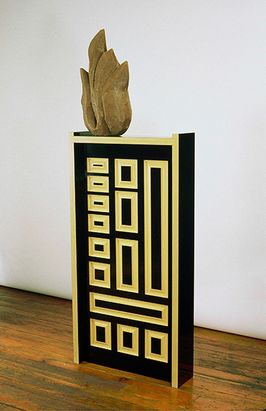
Changing rhetorical tack, while embracing a moment of Promethean irony, Loesberg has channeled elemental fire through a block of homemade MDF. Medium density fiberboard, MDF, is a manufactured wood product. It is a process where whole trees are grown in utilitarian, managed forests, then felled, chipped, pulped and, once brined in wax, resin and formaldehyde are then, finally, reconstituted as planks of sort-of-wood. The product is a mainstay of construction in China, Europe and North America.
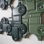
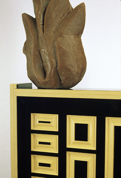
In “Fire Door” (2000), Loesberg, with a droll eye, de-industrializes the whole process. Scraping together the very undecorative detritus of his own studio and woodshop floor he has bonded sawdust with resin from which to shape a cartoonish version of a flame. Eschewing the need for decorative color –say, red– the lumpen block of fire sits atop a black and yellow raised panel door. The door, also manufactured by the artist, glares toward the viewer with no less than 14 raised panels almost all of which are different in size and shape from one another. The flame itself, produced in the studio from Loesberg’s block of homemade MDF, has, a thoroughly hand-made quality. It is so, so, so un-industrial, so un-machine made, so un-ornamental. Contrarily, the glistening door radiates a feel of lacquered distance. The piece is less about driving a wedge between ornament and its subject. Instead the play between finishes, gloss and matt, the squabble about color, none versus much, is rescued by the title, “Fire Door.” The title puns us through an internal dialogue about function and form, about the necessary and the dire. It chaperones a displacement of energy and urgency from fire to door. While the door itself is a virtuoso display of the unnecessary.
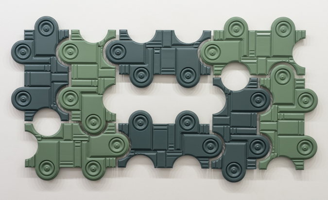
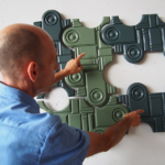
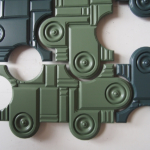
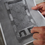
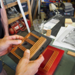
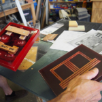
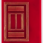
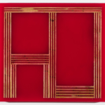
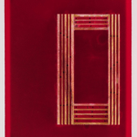
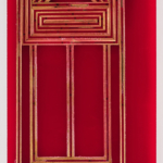
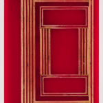
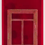
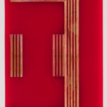
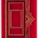
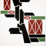
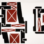
In Loesberg’s Illuminated Manuscript Pages the raised paneling of Fire Door is formally reprised, albeit in a scaled down version. This wall-mounted series of sculptures, based on Middle Eastern gilded and hand-painted books from the 16th through the 19th centuries, magnifies the rectilinear page layout of the manuscripts. To assemble the sculptures Loesberg embeds strips of grooved wood in tinted translucent resin. The wood resembles nothing so much as the edge view of plywood, a series of parallel laminates. Each piece from the series seems hand holdable, like the size of the original book. And the layout of each ‘page’ is basically a transcription of the illumination minus the text. Obviously enough, such a deletion or suppression of the text catapults the ornament into the foreground, no longer the ornamenting of something else, from which it threatens to steal the show; it now is the show. Any possibility of narrative or textual advance is mooted.
Yet the materials Loesberg uses, unassuming wood scraps and permeable seeming resin, tend to subdue the scene stealing. Through viscosity perhaps, or thickness and weight of the resin there are shifts in hue and tone. There is a haloing effect. There are apparent shifts in depth or density of the material that both encourage local incident to command ones attention, and they also evoke architectural space –a floor plan say. Each piece may indeed be a transcription of the original small page, but rendered thusly they seem to court aspirations toward larger territories. Simultaneously, we could note, that because of the resin’s lollipop red color, its sanguinary resonance and its texture and translucency the work crosses a sensory threshold. One wants to eat it, lick it. Such impulses are far from beyond the ken of the ornamental. Indeed this is one node of ornament’s seduction; the ornamental is a species of carnal displacement.
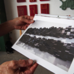
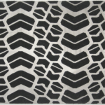
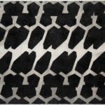
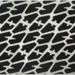
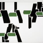
Within Loesberg’s main focus, his tender but also inquisitively exacting enquiry about the built world of architecture, this sense of the carnal is abridged. As such one could think it curious that he does not directly address that portion of the American industrial come cultural world most notorious for such carnality: Detroit. Well, almost not. In a shrewd benediction of the left behind —of the barely noticed— he pulls out of his hat tire tracks. Not the usual stuff of Detroit iconography. Not 1950s tail fins or 2010s trophy marques, but rather anonymous tire treads. These drawings are, as he puts it, “High Modernist beauty extracted from utilitarian industrial design,” which is, by and large, something we also say about the Seagram building. Filling the rectangular frame of the drawing, rather than being a ‘stripe’ of tire tread, the images initially escape their referent and the attendant notion of traveling from here to there, or the romance of winding from Chicago to L.A. Instead, hand rendered in charcoal on paper, these monochrome pieces rhyme with glimpses of Modernist abstraction: Cubo-Vorticist jags, sometimes Myron Stout or even Picasso’s beloved dazzle camouflage.
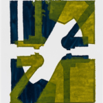
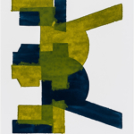
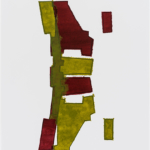
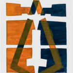
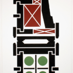
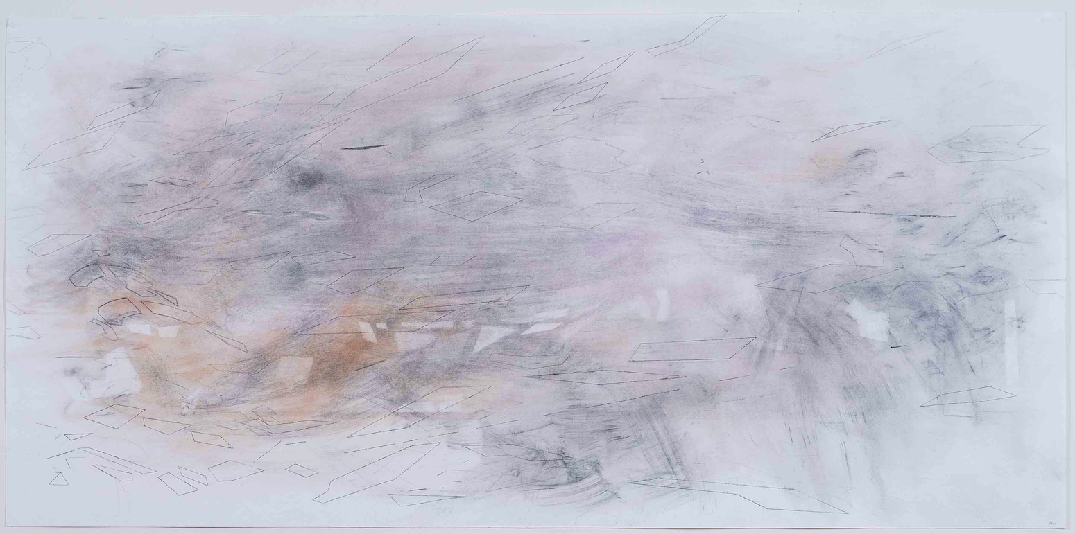
While in his draughtsman mode Loesberg also careens back toward architecture. Rather than tire treads he explores urban plans. Starting with Nolli maps, whose historical function was to graph and document the accessibility and flow of space and movement within a city, Loesberg strips function away and compiles visually layered, colored ink drawings. These are then drawing-maps that are devoid of language such as, street names, city name, building numbers, elements that would allow utility. Loesberg situates his revisions to the Nolli maps squarely outside the pale of city schemes; all while seeming to woo a neo-geo stain maker.
Together the treads and the Nolli maps propose a breed of modest subversion. Loesberg is not exactly promoting semiotic chaos. After all he is doing little more than coaxing the repressed of Modernism back into the light. However, in doing so he leaves one adrift with functionless maps, bewildering flows of traffic, and flows of desire detoured into nifty Detroit commodities, which he more or less ignores in favor of their ‘decorative’ tires. Consistent with his sculptural address to architecture, in all of these drawings Loesberg brings the rear to the fore. This is his mode of iconoclasm; the utility of the image or object is foresworn, swarmed and its function eclipsed by its own decorative echo.
http://www.noahloesberg.net
